


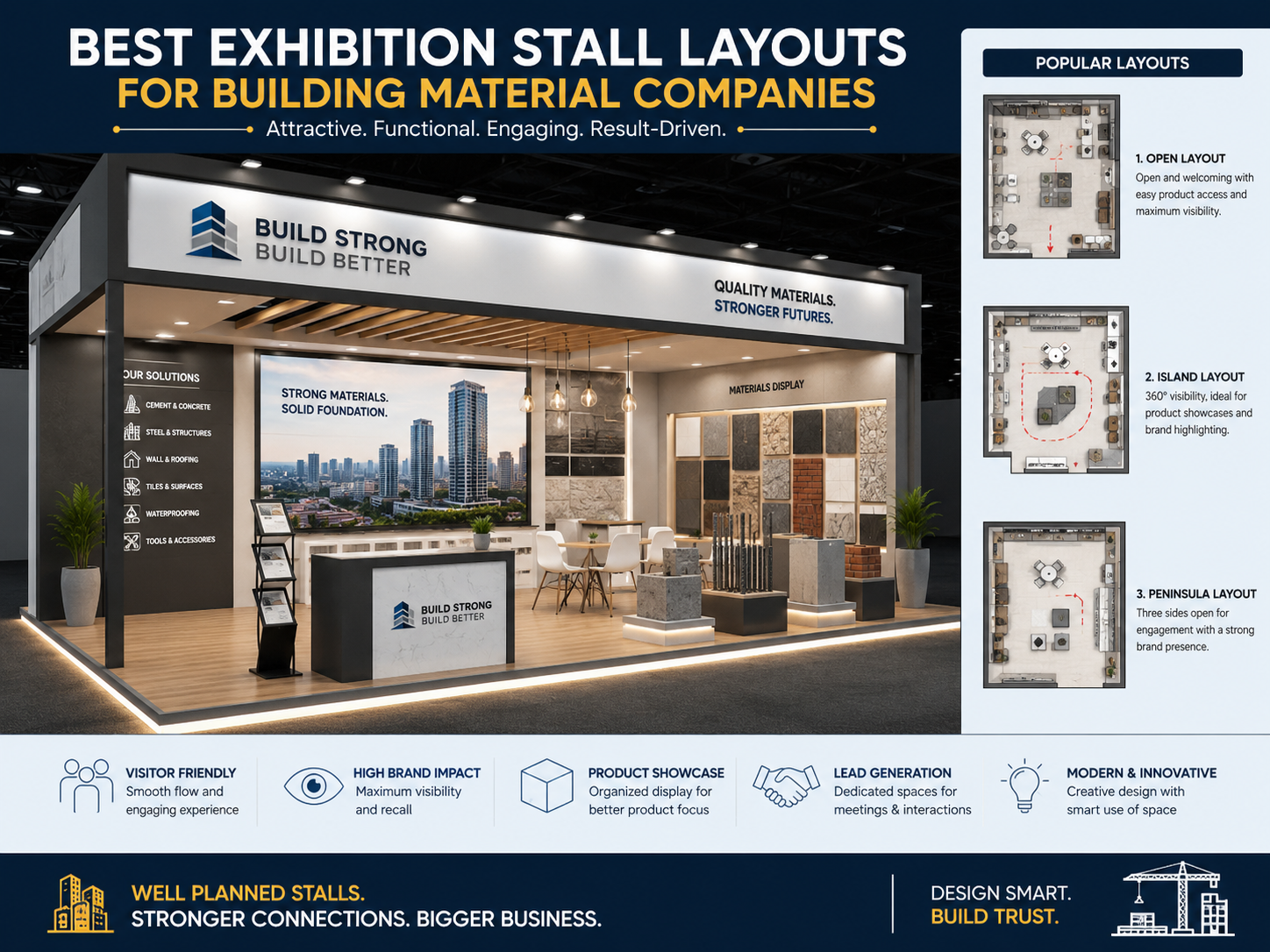
The right exhibition stall layout for building material companies does more than look good in photos. It shapes how visitors move through your space, how clearly your product range is understood, whether your team gets time to speak with serious buyers, and ultimately, how many leads you walk away with. This guide breaks down the layouts that work best for this industry, the design elements that matter most, and the mistakes that quietly cost exhibitors business every season.
Quick answer: What is the best exhibition stall layout for a building material company? There isn't a single "best" layout for every brand, but for most building material exhibitors, a product-zoned layout combined with a dedicated demonstration and meeting area works best. It lets visitors browse different product categories at their own pace, see materials in action, and still gives sales teams a quiet space to hold serious conversations with architects, dealers, and contractors.
Why Stall Layout Matters for Building Material Exhibitors
A stall layout is essentially a traffic plan disguised as a design. Get it right, and it quietly does a lot of work for you.
- Visitor movement and traffic flow – A well-planned layout guides visitors naturally from the entrance through your product range, rather than leaving them unsure of where to look first.
- Product visibility – Building materials often need to be seen from multiple angles or in context (a tile on a wall panel, a door in a frame). Layout determines whether that's possible.
- Brand presentation – A cluttered stall dilutes brand identity. A structured layout gives your branding room to breathe.
- Product demonstrations – Many building material categories rely on live demos to convert interest into orders. Layout decides if there's space for this.
- Sales conversations – Serious buyers need a place to sit and talk business away from foot traffic.
- Lead generation – Ultimately, every layout decision should support capturing and qualifying leads, not just attracting footfall.
- Space utilization – With booth space at a premium, an efficient layout ensures nothing is wasted on dead corners or awkward blind spots.
7 Best Exhibition Stall Layouts for Building Material Companies
1. Open-Plan Exhibition Stall Layout
What it is: An open, unobstructed layout with minimal partitions, allowing visitors to walk in from multiple sides.
Ideal booth size: Works well from 18 sqm upward, though it can be adapted for smaller spaces too.
How it works for building material brands: This layout suits companies that want maximum footfall and a welcoming, no-barrier first impression — common for tiles, hardware, and fittings brands with a wide product range to browse.
Best product categories: Tiles, hardware, fittings, décor products, and smaller building accessories that invite casual browsing.
Advantages: High approachability, easy for visitors to enter and exit, good for capturing walk-in interest.
Limitations: Less privacy for sales conversations; can feel exposed for high-value technical discussions.
Lead generation value: Works well as a top-of-funnel layout — it pulls in volume, which you then filter through your sales team into qualified leads.
2. Product-Zoned Exhibition Stall Layout
What it is: The stall is divided into clearly marked zones, each dedicated to a specific product line or category.
Ideal booth size: 24 sqm and above, since each zone needs enough room to stand on its own.
How it works for building material brands: Companies that manufacture multiple categories say, a brand selling both tiles and bathroom fittings benefit from separating these visually so visitors don't confuse one range with another.
Best product categories: Companies with diverse portfolios: building material groups, hardware conglomerates, or multi-category construction brands.
Advantages: Clear product categorization, easier for visitors to find what they need, supports focused sales conversations per zone.
Limitations: Requires more space and careful signage to avoid the stall feeling segmented or maze-like.
Lead generation value: Sales staff assigned to specific zones can qualify leads faster, since conversations are already narrowed to a product category.
3. Central Product Display Layout
What it is: A hero product or flagship display is placed at the center of the stall, drawing visitors inward.
Ideal booth size: Works from 12 sqm upward, including smaller stalls.
How it works for building material brands: A cement brand might centre a model showing structural strength; a doors and windows company might display its premium range as the centerpiece surrounded by supporting products.
Best product categories: Brands with one strong flagship product or a signature innovation they want to lead with.
Advantages: Creates a strong visual anchor, naturally draws visitors toward the middle of the stall, works well for photography and brand recall.
Limitations: Can overshadow other products if not balanced with peripheral displays.
Lead generation value: A striking centerpiece is often what starts the conversation — visitors approach out of curiosity, giving your team a natural opening.
4. Demonstration-Focused Layout
What it is: A layout built around a working demonstration area — think a live application counter, a mixing station, or a mock installation.
Ideal booth size: 20 sqm and above, to accommodate both the demo area and viewing space.
How it works for building material brands: Paints, adhesives, waterproofing solutions, and coatings all benefit from being shown in action rather than just displayed in a can or tin.
Best product categories: Paints and coatings, adhesives, sealants, waterproofing products, and any material where performance needs to be seen to be believed.
Advantages: Builds credibility, creates memorable visitor engagement, naturally draws a crowd.
Limitations: Requires trained staff to run demonstrations consistently throughout the day, and enough clearance space for safety.
Lead generation value: Visitors who stop to watch a demonstration are already engaged — this is often the easiest crowd to convert into a genuine conversation.
5. Consultation and Meeting-Focused Layout
What it is: A layout that dedicates a meaningful portion of the stall to seating, meeting tables, or private discussion pods.
Ideal booth size: 18 sqm and above, though even smaller stalls can carve out a two-seater consultation corner.
How it works for building material brands: Architects, contractors, and distributors often want to sit down, review catalogues, discuss specifications, and negotiate terms — not just glance at products in passing.
Best product categories: Sanitaryware, doors and windows, building technology, and any product involving project-level specification decisions.
Advantages: Signals professionalism, gives sales teams the space to close serious deals rather than rushed conversations.
Limitations: Reduces the floor area available for product display, so it needs to be balanced carefully.
Lead generation value: This layout is where casual interest turns into qualified leads — the meeting area is often where contact details, project timelines, and budgets actually get discussed.
6. Experience-Based / Interactive Layout
What it is: A layout built around digital screens, interactive touchpoints, samples visitors can handle, or small technology-driven experiences.
Ideal booth size: 24 sqm and above, since interactive zones need dedicated space and clear sightlines.
How it works for building material brands: Building technology companies, insulation brands, and roofing companies can use screens or touch-and-feel sample walls to explain technical benefits that are hard to convey with static signage alone.
Best product categories: Insulation, roofing, building technology, and any product where the value proposition is more technical than visual.
Advantages: Increases dwell time, helps explain complex technical benefits simply, differentiates the stall from more traditional competitors.
Limitations: Requires investment in technology and reliable setup; needs backup plans for technical glitches.
Lead generation value: Interactive elements are excellent for capturing visitor data — many can be tied directly to lead-capture forms or contact detail entry.
7. Island Exhibition Stall Layout
What it is: A stall with open access from all four sides, typically used for larger booth spaces without adjoining neighbours.
Ideal booth size: Generally 36 sqm and above, since it needs open space on every side to be effective.
How it works for building material brands: Larger manufacturers exhibiting flagship ranges of cement, large-format tiles, and structural systems benefit from the 360-degree visibility an island layout offers.
Best product categories: Large-format products, structural building materials, and brands with a strong market presence wanting maximum visibility.
Advantages: Visible from every aisle, allows dramatic branding and large-scale product displays, no back-wall limitations.
Limitations: Higher cost, both in terms of space rental and design complexity; requires strong branding on all sides since there's no "back" to hide behind.
Lead generation value: The visibility alone increases footfall, and with the right zoning inside, this footfall can be converted efficiently across multiple touchpoints simultaneously.
Ready to plan your next exhibition stall?
Get in touch with The Propshop India to discuss your layout, design, and fabrication requirements for your upcoming trade show.
Get a QuoteHow to Choose the Right Stall Layout for Your Building Material Brand
There's no universal formula, but these factors should guide the decision:
- Booth size – Some layouts (like island or demonstration-focused) need more room to work properly.
- Product dimensions – Large or heavy products (sanitaryware, structural samples) need different spatial planning than smaller items like fittings or hardware.
- Number of products – A wide portfolio may call for zoning; a focused range may suit a central display approach.
- Visitor profile – Are you mainly meeting architects and specifiers, or retail dealers and distributors? This affects how much meeting space you need.
- Demonstration requirements – If your product needs to be shown in action, factor in space, safety clearance, and staffing.
- Number of sales representatives – More staff usually means you can support more zones or simultaneous conversations.
- Storage requirements – Building material samples, brochures, and spare stock need a place that's out of visitor sightlines but easily accessible to staff.
- Meeting space – Decide early how much of your footprint goes toward serious business discussions versus display.
- Budget – Fabrication complexity scales with layout ambition, so align your layout choice with what you can realistically invest.
- Exhibition objectives – Brand visibility, lead generation, product launches, and dealer meetings each call for slightly different layout priorities.
Key Design Elements Every Building Material Exhibition Stall Should Include
Regardless of which layout you choose, certain elements consistently make a difference for this industry:
- Product displays that show materials at eye level and in realistic settings, not just stacked on shelves.
- Sample walls for tiles, laminates, paints, or finishes, letting visitors compare options side by side.
- Material libraries for brands with extensive ranges, organized by category or application.
- Product demonstration zones with enough clearance for safe, repeatable demos.
- A reception counter that acts as a clear first point of contact.
- Meeting areas that feel private enough for real business conversations.
- Storage that's discreet but accessible to staff throughout the day.
- Branding that's consistent, visible from a distance, and reinforces what the company actually makes.
- LED displays for product visuals, certifications, or project case studies.
- Interactive technology where it genuinely adds value, not just for novelty.
- Clear signage so visitors can self-navigate a large product range without needing to ask.
- Lighting that does justice to textures and finishes — critical for tiles, stone, and surface products.
- A strong CTA, whether that's a QR code, a sign-up sheet, or a simple prompt for visitors to leave their contact details.
Common Exhibition Stall Layout Mistakes Building Material Companies Should Avoid
Even experienced exhibitors fall into these traps:
- Overcrowding the booth with more products than the space can comfortably hold.
- Displaying too many products without any hierarchy, leaving visitors unsure what the brand actually specializes in.
- Poor visitor circulation, where people get stuck in one corner and never see the rest of the stall.
- Insufficient meeting space, forcing important conversations to happen standing in a busy aisle.
- Weak branding that gets lost among the products themselves.
- Poor lighting that makes materials look dull or washes out finishes and colours.
- No storage, leading to boxes and bags cluttering the visible stall area.
- Lack of interactive elements, making a technical product range feel flat and forgettable.
- Difficult-to-understand product categorization, especially for brands with wide portfolios.
- No clear lead-generation strategy, meaning good footfall doesn't translate into a usable contact list afterward.
How a Professional Exhibition Stall Designer Can Help
Planning a layout that balances product display, demonstrations, meetings, and branding within a fixed footprint is genuinely difficult to do well without experience. This is where working with an established exhibition stall design company makes a measurable difference.
A team with real exhibition industry experience will typically:
- Take time to understand your brand, product range, and what you're trying to achieve at that specific show.
- Plan visitor flow so the stall doesn't just look good on paper but works in practice, with real crowds moving through it.
- Create product-focused layouts that give each category the visibility it deserves.
- Optimize the space you've been allocated, rather than forcing a generic template onto it.
- Incorporate your branding consistently across every panel, counter, and signage element.
- Design demonstration zones that are safe, functional, and easy for your staff to operate.
- Integrate technology where it adds real value to the visitor experience.
- Handle fabrication and installation end-to-end, so you're not managing multiple vendors on-site.
- Deliver a turnkey exhibition solution, from concept to teardown.
The Propshop India works with building material manufacturers, distributors, and related brands on exactly this kind of layout planning — bringing years of exhibition stand design and fabrication experience to booths across shows in India and Europe, including for exhibitors travelling to markets like Germany, France, Italy, Spain, and the Netherlands.
Conclusion
For building material companies, exhibition stall layout isn't a cosmetic decision; it directly affects how visitors experience your products, how many meaningful conversations your team has, and how many of those conversations turn into leads. Whether you choose an open-plan layout for maximum footfall, a demonstration-focused design to show your product in action, or a zoned layout to organize a wide portfolio, the goal stays the same: make it easy for the right visitors to find you, understand you, and talk business with you.
Before your next show, take a hard look at your product range, your visitor profile, and your business objectives, and let those decisions shape your layout not the other way around.
Ready to plan your next exhibition stall? Get in touch with The Propshop India to discuss your layout, design, and fabrication requirements for your upcoming trade show.